Building a “digital dashboard” – Part 2 Technical side using Microsoft PowerBI
Introduction
I have been using Microsoft product for over 20 years, starting with MS-DOS, and Windows 3.1. Microsoft PowerBI is my favorite software so far: It is simple, updated frequently, and has the right amount of configuration to “get things done”. The user community used to be small back in 2015, but it is catching up quickly with the forum, free resource (YouTube search “PowerBI”) and paid resource (high-quality material like SQLBI and PowerPivotPro) .
At the same time, as an analytics practitioner, I also understand it is vitally important to keep a mindset of “software independent”. What matters the most is the ability to deliver high-quality deliverable in the most efficient way. A technology tool like PowerBI can help to achieve that, however, we need to be cautious of falling in love with the software, not your own craft and the value delivered.
That is why Python, a mostly independent open source programming language, is playing another important role in the technical architecture for building the “dashboard”, and particularly on the “data acquisition” phase. Microsoft actually has its own language called “M” or “PowerQuery” that can potentially do the same thing. It will be interesting to observe how it can evolve.
Compared to the “fun” business side of building a dashboard, the technical side of making a dashboard from concept to reality is bittersweet. On the one side, frustration is easily getting accumulated when facing a variety of challenges, especially when working solo. On the other side, the feeling of “solving a problem” and growing competencies are the source of my willpower. I’d like to breakdown the technical side into the following three “analytics” area:
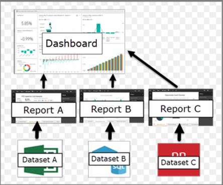
Data Storytelling
This part is likely carrying the most weight on the whole deliverable, as the analyst is usually getting judged on by its customer – whether it is fair or not will become a whole other topic.
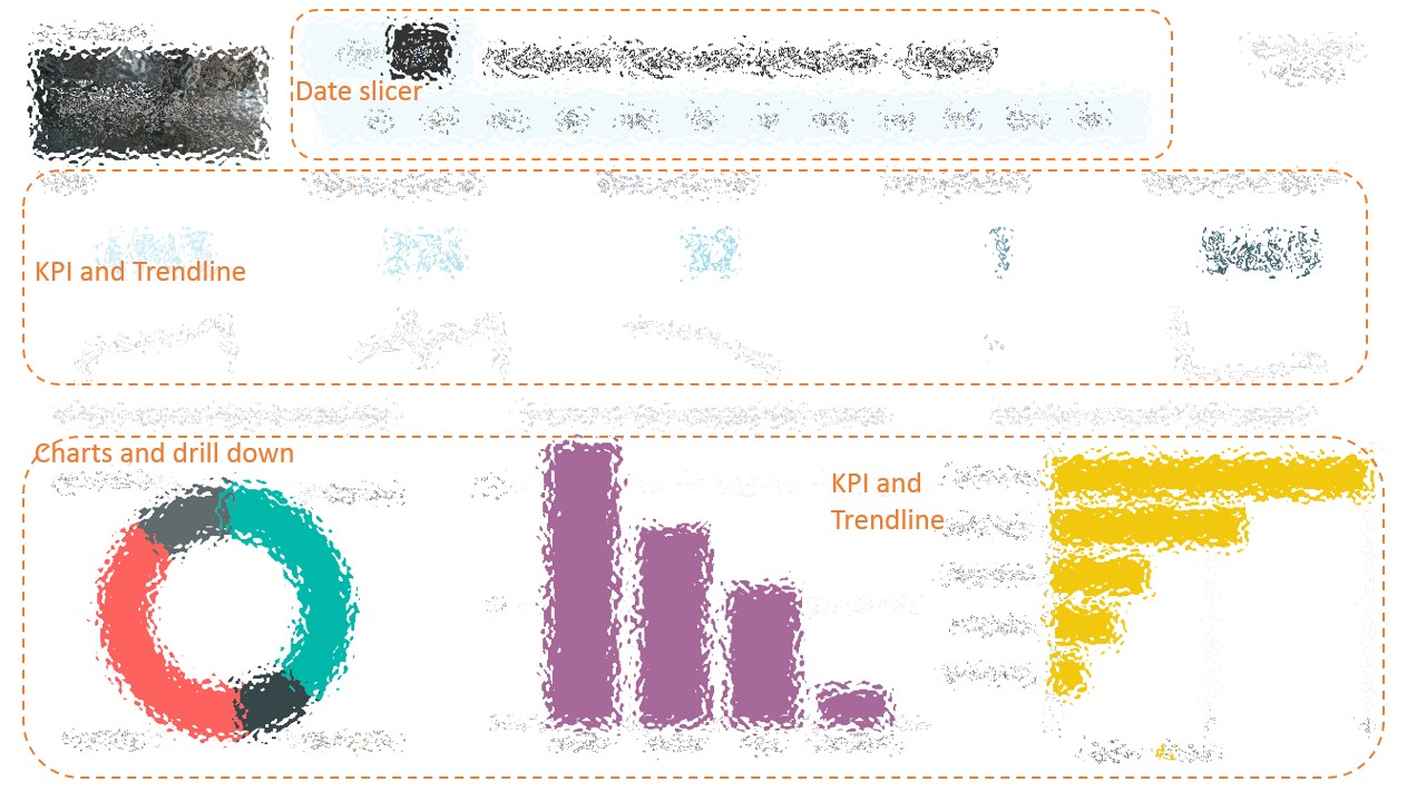
When I am approaching the assignment, the principle is “KPI on top, with context”, and “charts on the bottom, with drill down”. Like this (screen shot example, Apologize I need to intentionally make the dashboard vague to protect confidentiality.)
Data Modelling
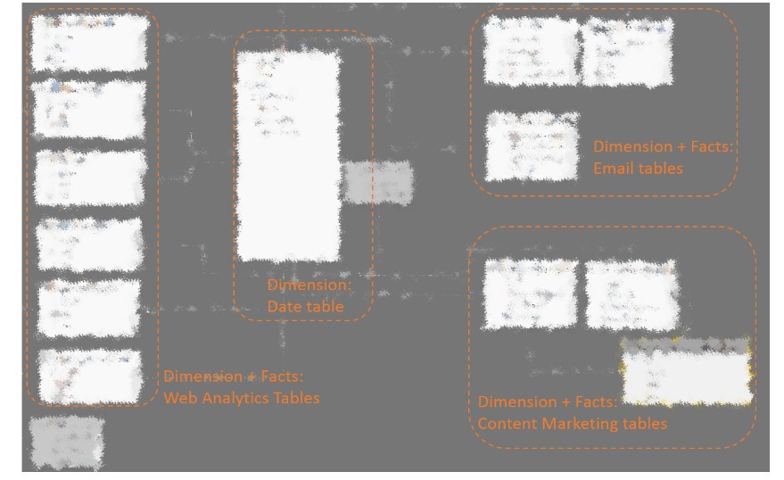
I’d admit I am not an expert in this field yet. The model I have built is not even fully aligned with the optimized “star schema” yet – most of the tables are linked to the data table in a “many to 1” relationship, in order to activate the data slicer in the dashboard.
Surrounding the center “Date Table”, there are
- Web Analytics tables, streaming against the Rest-API empowered web analytics vendors’ existing report.
- Email Analytics tablets: semi-automated CSV file (can be supplied by Python code)
- Content Marketing tables: streaming against the standard PowerBI connector.
The other part of the modeling is using DAX(Data Analysis Expression) to create customized “measure” and “column”. I found it relatively easy to start after reading this book. It is definitely an upgrade to “Excel formula”. For example, we can write the following DAX to calculate “qualified leads”, which exclude any leads which using your company’s email.
Qualified Leads = CALCULATE(DISTINCTCOUNT(‘Email Table 1′[Email Address]),SEARCH(“yourcompany.com”,’Email table 1[Email Address],,0)=0)
Data Acquisition – M
I became a fan of PowerBI because of its data preparation capabilities. In my previous job, I used to work with a leading ERP solution’s “cutting edge” BI tool – it was such a painful experience which only leaves me an impression of “ETL(Extra, Transform and Load) is really really hard”. I self-taught myself in PowerBI (PowerQuery) in the past 18 months, however reading this book definitely gives me a holistic view and a path for further development down the road.
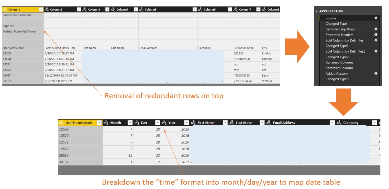
Using another “email metrics” example. By using PowerBI’s ETL(M) feature, I was able to automate the data preparation(two main task – remove redundant rows on top, and breakdown the non-compatible time format into month/day/year columns). Therefore, next time when I bring new data, I just need to click “refresh” and all the preparation are being completed automatically by the software.
Data Acquisition – Python
As I have written in this post, Python is a powerful tool to pulling metrics from external vendors in the digital world. When playing with a visualization tool like PowerBI, we can use a CSV-format as a “data input”, while also as an “output” from the Python script. The script can be written against any API services, usually provided for free like Facebook Insights, Google Analytics, Spreadfast etc.
Compared to an alternative way of using standard “PowerBI connector”, this method gives us much greater flexibility to customize the dimension and measures of the data.
There are two main ways to leverage Python’s well reputable libraries to achieve data acquisition tasks.
- Using “Requests” library to call the API services, provided by Google Analytics or AdWords, Facebook Page Insights and other tools.
- Using “Selenium” library to “mock” the mouse and keyboard actions to download metrics. This can be used in other service providers which don’t provide API access.
Reference
By now we have concluded this blog series on building the digital dashboard. The following material I have benefited greatly on this journey.
- Podcast: Digital Analytics PowerHour – What is a dashboard by Michael Helbling, Tim Wilson, and Jim Cain. This podcast talked a lot of why and what is a great dashboard, in the digital analytics context.
- Book: Information Dashboard Designby Stephen Few. This book set up the technical foundation for “how” to build a great dashboard, without getting into the tool itself
- Video: Curbal by Ruth Pozuelo Mtnes . It is the best channel I have found in YouTube so far and I learned most of my tricks in PowerBI (the tool) from it.
One Comment