It has been 9 months since I first shared experience to track tennis performance with Apple Watch. Backing up by popular demand(Surprised so many visitors found this blog from search engine all over the world), I’d like to take it further with a more in-depth review, of my own experience tracking and analyzing my tennis workout with the Swing app.
What is changed:
- Apple watch series 4! A key reason to spend another $500 is to improve the loading speed of Swing. From my eye test, it roughly improves from 10 seconds(with my original watch series 2) to 3-5 second. The original plan wasn’t to replace it this soon when I purchased it 2 years ago. This small gadget has made a positive impact on my life – giving me an option to a functional alternative to my smartphone, which I found increasingly impacting my life negatively.
- Swing Premium , a $CAD6.49 subscription service launched in Aug 2018. It is now allowing me to view my complete shot distribution and swing speed, which will be addressed later. As “power user” with tech and business background, I am happy to pitch in as an early paid user. Hopefully, their business model will make it in the end.
- The shot tracking finally seems to be working for me, with the new equipment and new paid service. I still need to switch the watch to my right hand, my dominant one, when playing the game – it takes a while to get used to it.
Comparing to the tenniskeeper, which I also proudly paid for, Swing has a much better UI design interface that connects to my emotional part of the brain- It simply makes me feel “enjoyable” to use it. That is the primary reason I am sticking with it this year.
What am I expecting from this tracking app
Once becoming a paid customer, especially at this price – $80 anually($$6.49 X 12) – the expectation is naturally soaring. Ideally, the product is delivering MUCH MORE value than its cost. This is also the plan to structure this article:
Following are the potential value it can appear to a regularly exercised tennis enthusiast like me:
- Provide reliable basic metrics – which is both consistent with Apple’s build in metrics, and extend beyond its capability. In this case, Apple’s native workout provide “Carolines burned and Heart Rate distribution”. I would like to know the total running distance – a metric to show my activity level in the court. An educated guess here – I am willing to pay $0.10 for it each workout. In this case, that gives a value of $0.40 each month when average 1 tennis workout every week.
- Show reasonably accurate shot distribution metric – how many shots I took in total from a game – among them – how many are forehands, backhands, serves and volley. These metrics can help me analyze the actual performance, against my pre-defined game plan. For example, a big priority for me this year is to add net aggressiveness to my repertoire. In this case, I’d like to go to the net at least 10 times every set I played. Right now I am counting them manually. If the app does tasks like this, I am happy to pay $0.50 every game, that equals to $2.00 every month.
- Understand the speed of my serve will drastically fulfilling my curiosity. As a tennis fan, I am always amazed by the aces hit by those professional tennis players. How far am I away from Rafael Nadal in terms of speed of serve? If I can know that at a reasonable accuracy level (80% accuracy is enough), that will be thrilled to me. I am happy to pay $0.05 per serve if I can get that stats. Assuming a set will include 5 serve game, and I can serve 6 times each, that will give me $1.50 per game, subsequently translating to $6.00 per month.
All the dollar value here are subjective, serving the purpose of evaluating its cost mostly. You can also tweak it based on your own weight or criteria. For me, I’m happy to pay for the $6.49 subscription fee, as long as the app delivered all of my above expectations(an $8.40 value). But does it? Let us see:
What the Swing tennis tracking app is delivering
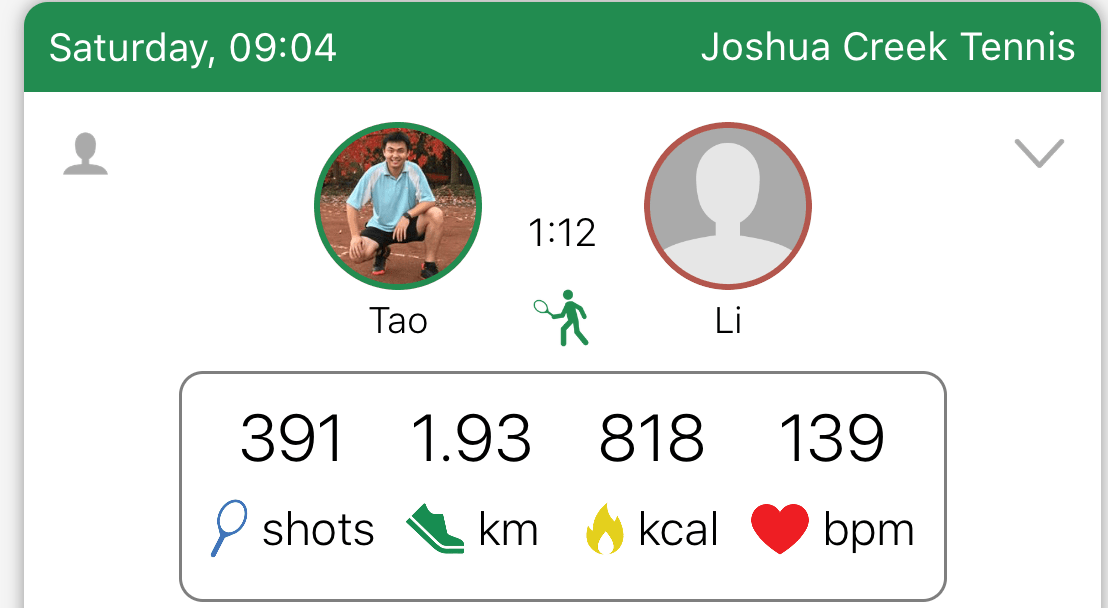
- First, let us look at the basic metrics. In the following aggregated view, it is clear and concise with the metrics that are averaged. Running distance is available as well in the 2nd one from the left. Overall it is aesthetically well designed.

As an analyst, aggregated metrics is never enough. At least we need to break them down by time series. This is the time that my disappointment kicks in. I don’t understand why the “running total” is used in both “distance run” and “Calories burned” chart.
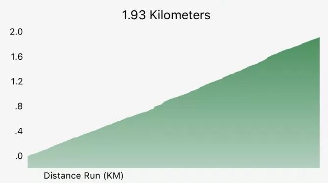
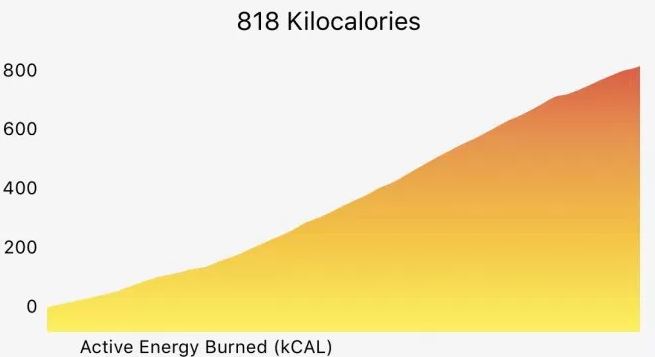
By doing this it smoothened the trend and made it almost a straight line, and it has become almost impossible to detect any signals that could catch my interest. The only one that is useful to me is the heart rate breakdown – it is telling me I have peaked at 180, and the valley illustrate my break time between games etc.
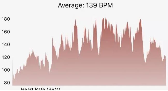

In the end, I will still give a passing mark on this piece – 65% – slightly above borderline. The metric is available, but not displayed in a way that can be easily consumed (by an analyst).
Shot Distribution and Swing Analysis
The basic metrics can be tracked with other tools even like a Fitbit (I believe). What set Apple Watch apart is the ability to track the details of every single shot – its swing speed, velocity and being able to detect what shot it is – forehand, backhand or serve. It usually required a professional tool like Zepp, a dedicated gadget.
It is logical to think the Apple Watch can track it, as it is a similar motion with swimming stroke- which can be tracked natively. Apple didn’t provide native swing tracking feature, which is understandable as the tennis segment could be too small, and they might also want to encourage 3rd party app(like Swing or TennisKeeper) to do the work for them.
The caveat here is in order for the watch to capture all these additional data, it has to be worn on the swing hand. For me, that means I need to switch it from my left wrist to right wrist whenever I play tennis. Not convenient, but necessary steps in order to get the data.
How is Swing doing in this area? Here is the output we can get after 1hr of tennis game with its “practice” mode tracking only:
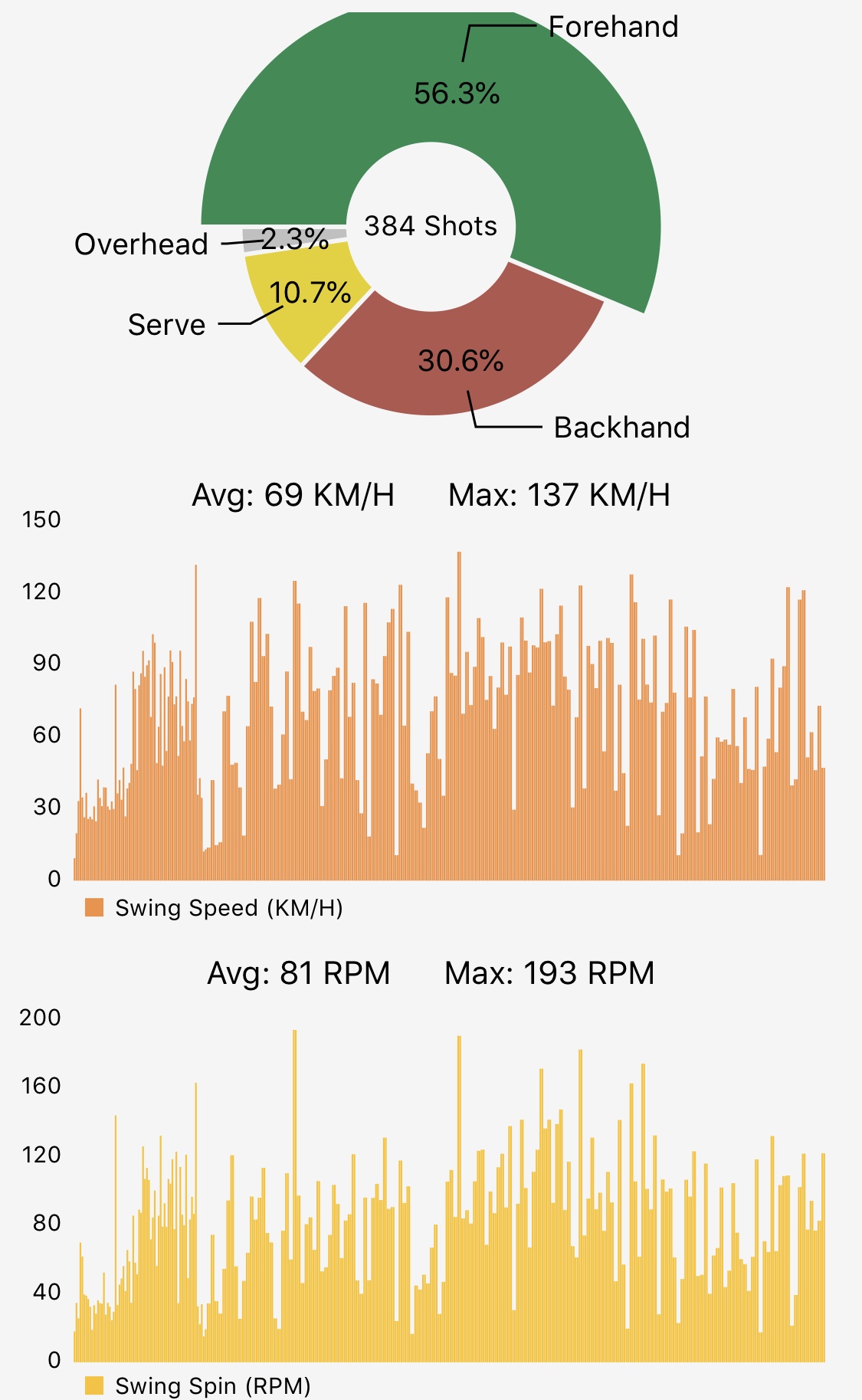

- The pie chart breaks down shot types. Almost 60% of my shots are forehand – which makes sense and passes my “gut check” here
- The two bar charts provide the distribution of swing speed and spin velocity. When I was writing this article, the app has an update adding the “Max” on top. It is a nice addition as it makes it easier to see the cap number.
The only “miss” is its inability to display volley/groundstroke.
Overall I would give it 80% mark – the visualization has surpassed my expectation, and the app keeps getting better with continuous new releases.
Serve speed availability
The feature that can provide me the most value is actually not difficult to achieve technically at all. We just need to move the finger to the “Serve” slice of the pie, and the same chart will give the speed and spin velocity just like the one showed previously for forehand shots distribution.
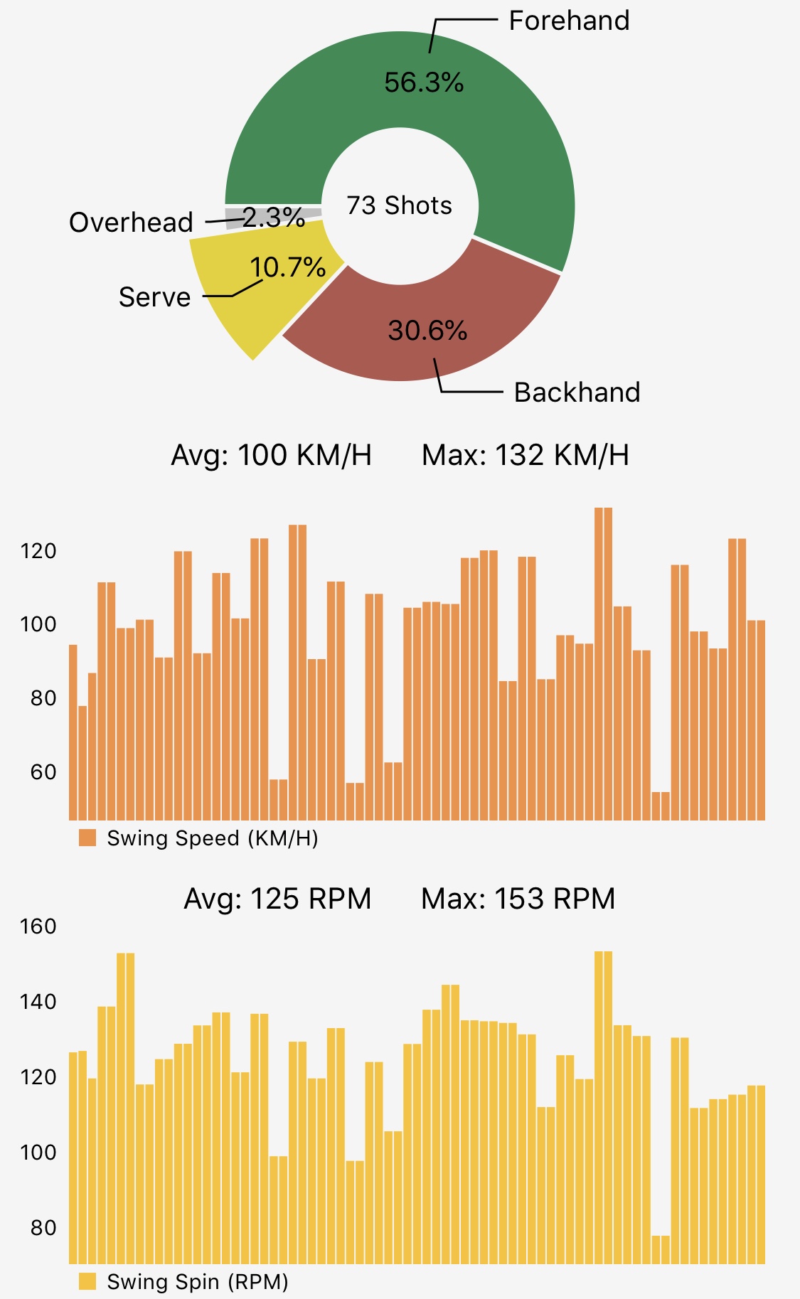

The key takeaways here – 73 serves in a match produce 100km/h average speed (which is roughly 60% of Rafael Nadal), and my fastest speed is currently at 132km/h – a little embarrassing but seems trustworthy. I used to test my fastest speed at Rogers cup event a few years ago, and it was indeed between 130-150 km/h mark.
These stats are quite actionable: I want to improve my serve and they can help me understand if I am on track or not. For example, for the winter of 2018/2019 season, I want to improve my service speed by 10% – that translates to 110 km/h of average speed, and 145km/h of max speed. Let us plot the chart by the end of the season, like this post for swimming performance, to see if I am able to make it, and subsequently analyze why/how.
There is a small software bug here- as almost all the serves were double counted (showed two bars next to each other). It won’t impact the average number, but still disturbing.
Overall this one is definitely meeting my expectation and I will give it a 95% mark.
Limitation
As I pointed out previously, the app still has room to improve. Here are some challenges I have faced so far, that you might need to be aware of:
- Lost workout in Apple’s health kit: After a workout is completed, it can’t be registered into Apple’s health kit from time to time. It happened twice for me in the last 3 month, especially when checking my real-time swing tracking. It is quite annoying, and I ended up with a “work around” – not touching the app at all after the app is launched on my watch.
- Limited customer service: When emailing them thru the official customer service email channel about the lost of workout issue, I didn’t get a response, which is disappointing. On the flip side, their email communications are okay – when a new feature is launched, the team will send a personalized email highlighting all the exciting stuff.
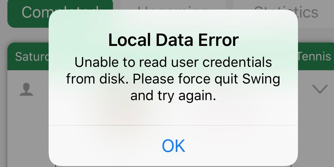
- App crash frequently (see below screenshot)

No data export feature
Different from the other health apps I have been using, the Swing app didn’t have a place to export all its data to a format like CSV. This is a red flag to me, as it doesn’t have the open attitude to let the users, who ultimately owned all the data, decide what can we do with them.
Technically it won’t be a challenge at all, as all of the data are clearly stored in a cloud storage place like AWS or Google Cloud or Azure. I understand it could be counter-argument claiming that the data format might not be readable to the normal user. But, that isn’t the job for the app developer to clean the data for the user. As a professional analyst, I can do that part myself. The lack of openness attitude concerns me a lot more.
Hopefully, they will add this feature down the road.
Conclusion
Compared to the tennis tracking experience 9 months ago, it is much more useful and satisfying right now, with the working swing distribution and serve speed tracking, using the Swing app. The new Apple Watch Series 4 with Watch OS 5 plays a role here. But I will bet the previous generation will still do the work, it might just be a bit slow.
Overall, it is a worthwhile investment to me with $6.49 CAD per month, and likely to those folks who love tennis and also are curious about the numbers and metrics.
Some flaws still exist and could be bothering for now. As an early adopter, it might be inevitable.
Next step
I’d like to start to track it my tennis workout as “match” instead of practice. In this case, it will provide much richer scoring tracking. It requires me to change habit again – look down and press my watch on every point. We will see how that experience will translate to my game performance. Update: I actually did it 4 month later. You can check out this post:Tennis score tracking and exported data analysis with Apple Watch using Swing App
Also I’d hope to validate the running distance myself. The raw number should be stored in the Apple workout exported tables.
Lastly I will keep an eye on Tennis keeper. Their blog seems to be quiet recently. These two app are competing directly with each other. I am a strong believer of competition drives customer experience.