Advanced Analytics with Swimming data from Apple Watch
This blog post is aiming to provide a step-by-step guide to perform advanced analytics on swimming data, captured by Apple watch. Microsoft PowerBI and Python on Jupyter Notebook are the primary tools to prepare, analyze and visualize the data.
You will learn how to export the workout data efficiently to your PC, make necessary data transformation, and understand what metrics and dimensions are available. Then I will walk you thru how to analyze the data to answer typical questions related to why certain behaviors happened. You will then see my preliminary attempt to use advanced analytics tools to predict future swimming performance.
Most importantly, you will find quite a few reference articles related to this topic, hopefully fulfilling your intellectual curiosity.
It is also the #3 articles of a series, the previous articles can be found here:
#1: How to use Apple Watch to monitor and improve swim performance
#2: Improving swimming performance with Apple Watch(WatchOS 4)
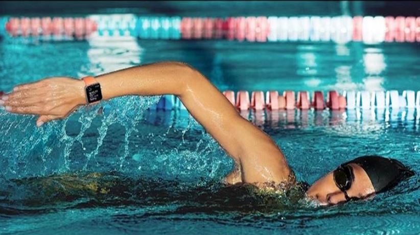
Another 10 months have passed since I posted my last article on swimming. During this period, I recorded another 32 swims workouts with my Apple Watch.
Ironically – I have never felt so proud of swimming in the past, despite kept doing it on and off over the last 15 years. Being able to measure it, and see myself making improvement based on number is much more fulfilling than I initially expected.
Highlight
-
- It only takes 3 clicks to export the health data from your iPhone to PC for analyzing.
- You can also find open source Python code to extract, transform the raw data set (.xml format) to a format(.csv) that is compatible with a visualization tool
- Use trendline and bar chart to pinpoint “how” the performance improved, but data itself isn’t enough to fully understand “why”
- Leverage PowerBI’s forecasting feature to predict future swim performance, based on the historical result
In this post, my goal is to use advanced tools (Python and PowerBI) to analyze, visualize, and predict my upcoming performance over the next 6-8 month.
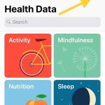
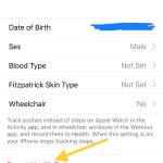
Export iOS Health data to a local PC
The procedure of exporting the health data to a local computer is straightforward. After opening the “health” app in the iPhone, you only need 2 clicks (see below screenshots) to have the raw data ready.
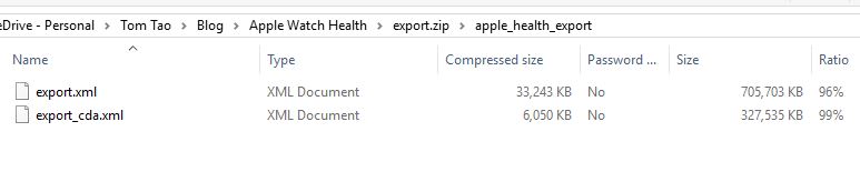
Depending on the usage of the Apple watch, the exported file might be too big to send via email. Mine is about 38M, and I used iCloud Drive to uploaded/downloaded into my computer.
Extract, Transform and Load (Get the data ready in PowerBI)
It is exciting to learn that Mark Koester from the other end of the world is doing similar things as I am doing. Instead of recreating the wheels, we are using his open source Python code to perform the first step of the ETL – get the raw data into readable CSV file.
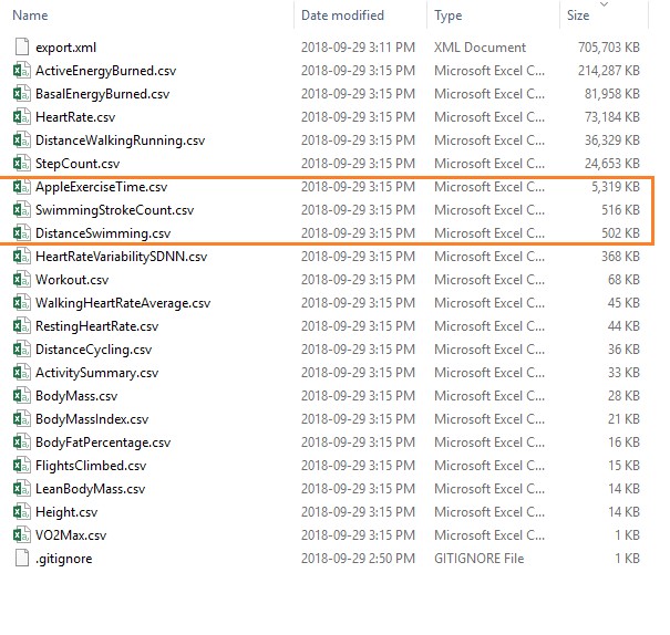
Raw Files (after extracted from the ZIP file)
In order to make Mark’s code work in my Jupyter Notebook, we need to make a slight adjustment by removing the quotation mark(showed in the below screenshot).
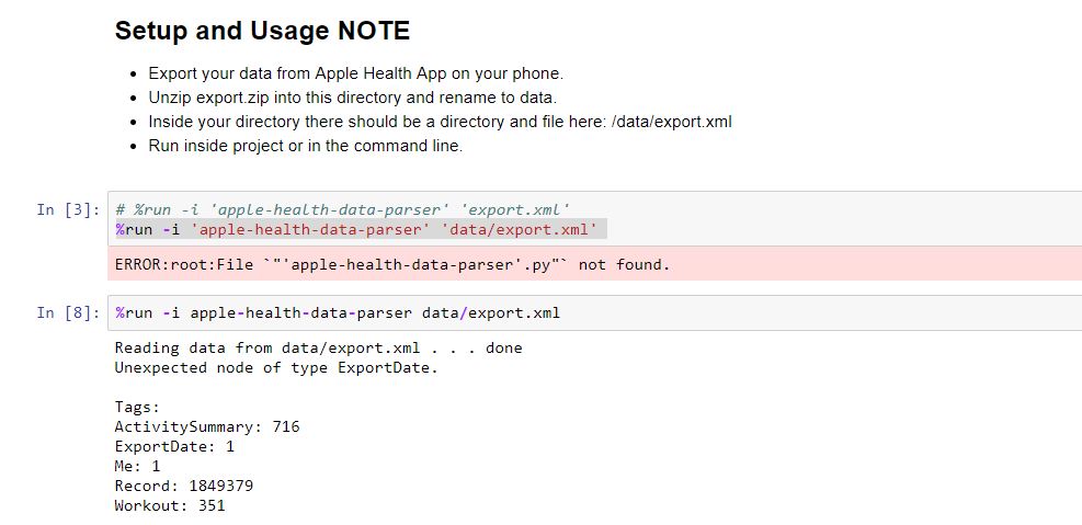
Basically, it is running a Python script, written by Nicholas J. Radcliffe, to translate the 700MB export.xml file(hardly compatible for analysis) to 21 separated CSV files that are “standard input” to both Jupyter Notebook and Microsoft PowerBI. The three main files required for following up analysis are highlighted below.
Analyze with questions
In general, I know as a fact that my speed has improved: It used to take me 47-48min to complete a 1500m(32min per 1km) workout in late 2016, and now it is taking me about 25-26min to finish 1km.
But how?
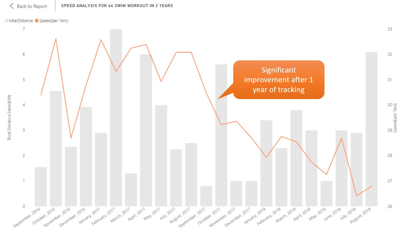
I turned to my dataset(workout.csv), and draw line/bar combo chart in PowerBI from all the workout data captured.
Initially, I only had the line chart in orange. Later on, the shaded bar was added to represent the total distance swam during the month, in order to understand the distribution better. Also, the data points were aggregated into the month-level, because visualize every single workout added too much variability and ultimately noise.
It is apparent that a step change happened during Q4 2017 (Sep – Jan) drove the improvement. Then I realized my previous blog post on Swimming with Apple Watch was published on Oct 29, 2017 and I made a claim:
Improve speed within the same targeted distance: My average speed per 100m has also improved from 3’10” in early 2017, to 2’45” in late 2017. My next step is to stabilize my speed in the 2’30” mark for the 1000m workout. I am curious to see when this can happen. My best estimate now is after 10 workouts. We have 8 weeks left in 2017 as of today.
In real life, I have decided to swim exclusively 1000 meters every time, usually a Sunday afternoon. Also, timing on finishing the workout was on the back of my mind each time. By the Sep 2018, I was able to reach the goal I set almost a year ago – finishing a 1000m workout with 25min (that equals to 2’30” per 100m). It takes almost 30 times of practice. And I have not stabilized it yet.
What did I learn here?
- Setting a clearly defined goal drives performance.
- It might take a lot more effort to get to the goal. In order to not get frustrated along the journey, we must be able to find joy out of it. In my case here, I feel lucky because I believe I actually forgot the 2min 30s mark what I wrote. Swimming became a habit for me, and it is my way of spending quality time with myself, or significant other to reflect and recharge.
- Data itself can rarely tell us why. In this case, if someone else is analyzing my swim performance, he/she won’t know the context behind what happened during Q4 2017.
Predict the future (Forecasting with PowerBI)
After generating all of these data points, I just can’t wait to understand – “What does my past 24 months of performance with 64 workouts tell about my future performance?”
Here is a simple yet impactful way of using PowerBI’s build in forecasting capability to predict the future performance.
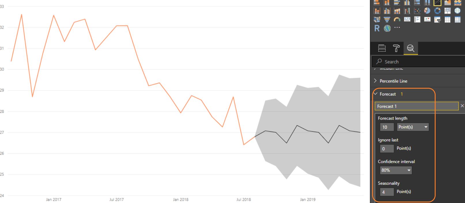
First please see the above screenshot of the predicted result. The grey shaded area is the predicted result by PowerBI’s algorithm.
Business-wide:
It appears that PowerBI doesn’t have lots of faith with my future improvement, as the forecasted trendline is basically flat. In 10 month (Jun 2019), it is projecting me to stay at 27min per 1km for a month, with an upside of 24.5min and downside of 29.5min with 80% confidence.
Also to be 100% honest, it is a little hard to trust this prediction as some important indicator like “I will be swimming in 25m pool moving forward as the 50m pool is no longer available”, and “I got a new apple watch which claims to track better” can’t be taken into account into this black box model.
This book called Superforecasting is an excellent mass market book that inspired my concerns on pure number-driven forecasting.
Technical-wide:
I am excited to see the forecasting can be easily visualized in this chart with a few touches of buttons. It is hidden in the 3rd tab in the “visualizations” panel in the PowerBI Desktop, and you can even select your “confidence interval” (higher the confidence, the lower the precision).
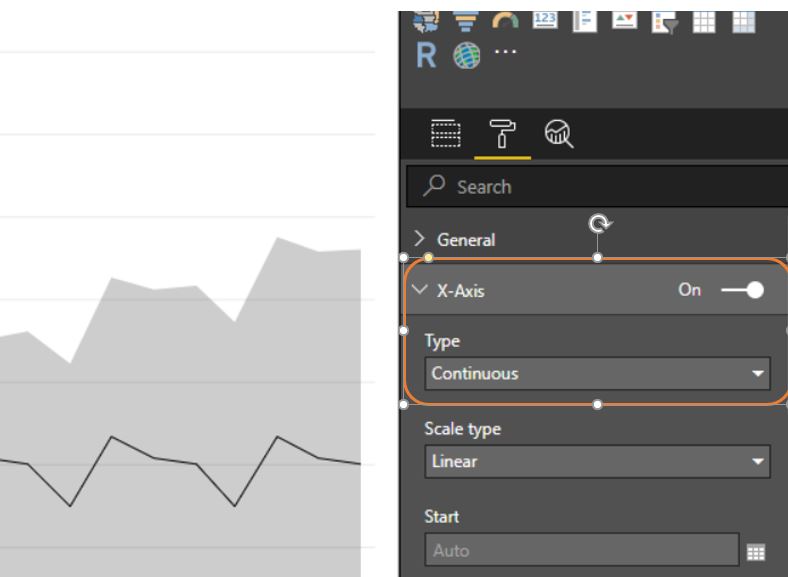
The one mistake I learned by generating the forecasting result is the X-Axis type needs to be “Continuous” instead of “Categorical” (See above screenshot). I typically use the later one it usually produces more clear data label on X-Axis, but it is not allowed if you need to use the forecasting feature.
This video summarizes the step by step guide of using this feature in PowerBI.
Bottom line:
I need to keep swimming. Otherwise, there will be no new data points to analyze. That will be a huge disappointment.
What’s next?
After 2 years of happy usage of this Apple Watch Series 2, I tricked myself to believe it will be another “investment” to upgrade it to Apple Watch Series 4. The impact of this new watch is yet to be determined.
Also, I want to continue the journey of building a predictive model for my swim performance. By going thru this exercise, the impact of visualizing is without a doubt. I would like to use Python (ideally built in PowerBI) to generate my own prediction.
One of the other goals I have made earlier this year was losing weight thru workout like swimming. I wasn’t able to make much progress year to date so far. Without many data points, my understanding is my diet wasn’t the style I wanted. I’d like to get some quick wins by losing another 5lbs for the last 3 month and add weight metrics in the follow-up analysis.
References & Additional Reading:
Here are the readings that inspired me to finish this 1500 word blog:
One Comment