Tennis score tracking and exported data analysis with Apple Watch using Swing App
During the winter of 2018-2019, I was able to take my tennis tracking journey into a new level. By now most of my tennis hitting partners are calling me a “data nerd”, clicking my watch like crazy during the game. But when I show them the stats after the game, they all (seem to be) impressed.
I did the following two new things in particular:
- Used the “Point by Point + ” score tracking in the Swing App to track all the points I have played. In total, I tracked 18 matches over the last 4 month, all of them were single matches and played in 1 hour.
- Exported the captured data into spreadsheets. By analyzing the data set, I was able to identify some of the limitations, as well as some opportunities to further enhance the analytics experience.
Before we dive in, if you are interested in knowing the tennis tracking tools and methodology, or a high-level overview, you can check my 1st blog post of this series: Tennis tracking after 18 month of usage. Or if you prefer to track drills instead of match, you can check out my last post on advanced tennis shots tracking.
Score Tracking
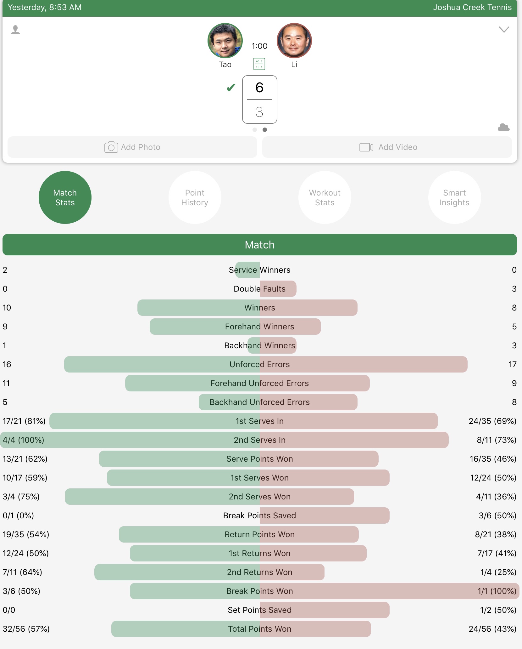
First – let us start with the outcome. Here is a sample match stats from a typical game I played (it was a game I played in Feb 2019) – You can see how I am comparing against my opponent in winners, unforced errors, 1st serve in %, and total points win.
You might ask me – “What does all of these metrics matter”?
To me, the number won’t lie. (they are not accurate all the time though…) All of these metrics can keep myself honest with my game, and find out why I was winning or losing. In the above example, my 2nd serve winning (50%) has an edge over my opponent (42%) while our first serve winning % is exactly the same at 57%.
On the other side, as an amateur tennis player who loves the game, the available stat sheet makes me feel good about myself (feel like a Pro).
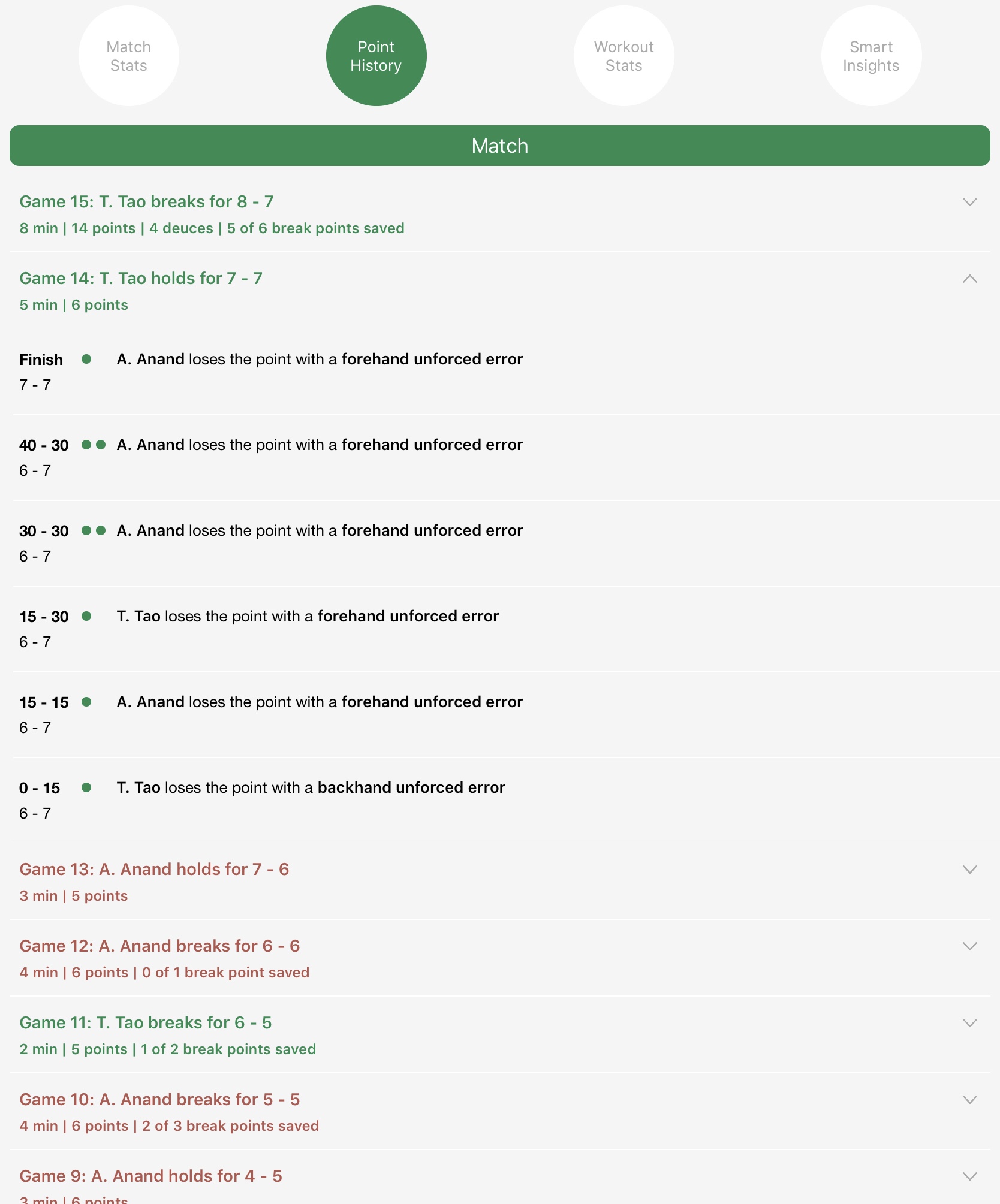
In addition to the full match stats, you can also get detailed points history. This can help you to do a post-mortem analysis of the game.
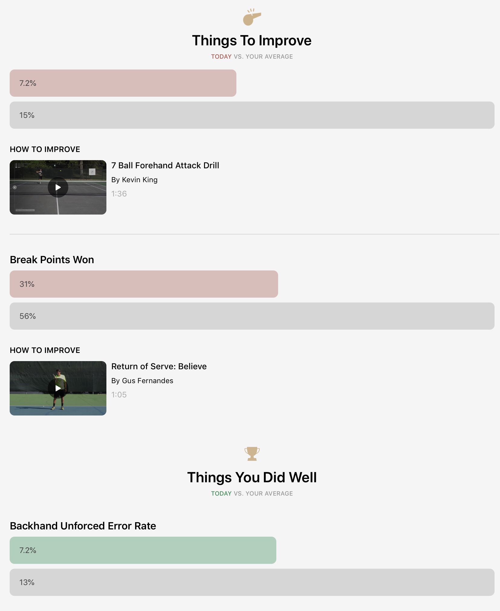
The additional insights available shows how this game is comparing to my average. I find it increasingly interesting and “make sense” after my benchmark numbers become more accurate after more games are tracked.
In order to get this, all I need to do is to train myself to press a bottom in my Apple Watch after every points I have played during the game.
It wasn’t comfortable, particularly at the beginning. And it can be disturbing to your opponent if not providing a heads-up. Personally, I got used to it after 2 attempts.
Analyzing the exported data in a spreadsheet
I complained about the data availability issue in my previous blog post. Surprisingly the team at Swing responded in Twitter informing me that it will become available.
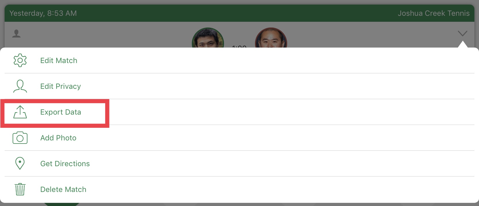
It did happen a few weeks later and now we can just click the drop down the bottom of the game, and then “Export data” is available as the 3rd selection (See below screenshot)
You can export the data (Excel format) to anywhere using standard iOS’s sharing feature. I choose to put it in my OneDrive folder, and it is also super easy to view it in Excel even in an iPad.
Data Structure
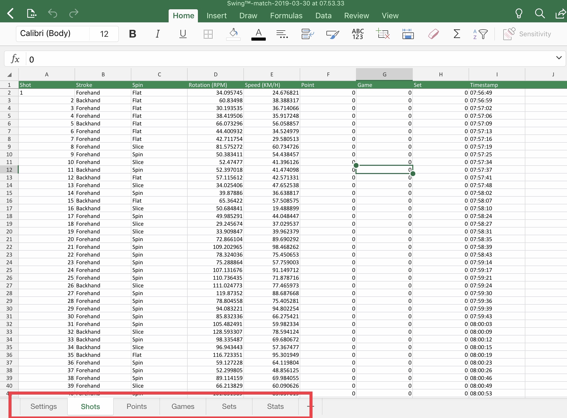
The exported XLSX is breakdown into 5 tabs (See below screenshots)
* Settings: auto-tracked high level “Mega” information of this particular game, including time, duration, location, etc.
* Shots: auto-tracked by Swing App via Apple Watch, including stroke type, speed, rotation and time
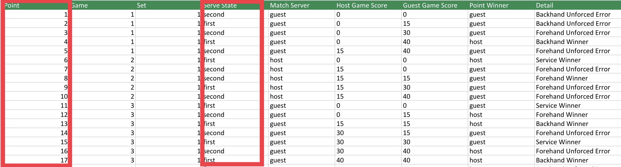
* Points: manually tracked by pressing bottom in Apple Watch after each point to identify a winner, unforced error, or a forced error.
* Games: auto-tracked the winner and the time of each game within each set
* Sets: auto-tracked the winner and the time of each set within the match
* Stats: calculated metrics for full match stats
The team at Swing has done an amazing job of keeping the exported data clean and well-structured. As an analyst by trade, I have dealt with exported data set from Facebook, Twitter and other tech giants and this exported dataset are by far the most user friendly one.
With that being said, the good format of the data doesn’t equal to the good quality of the data. When the raw data becomes available, it makes it possible for me to validate some of my previous hypothesis on data accuracy issue:
Data Issue
The problem:
One of the key benefits of using this tool is to understand and measure my serve speed. Unfortunately, it was compromised (at least for my own personal use) as it can’t properly distinguish an overhead and a serve. See below screenshot:
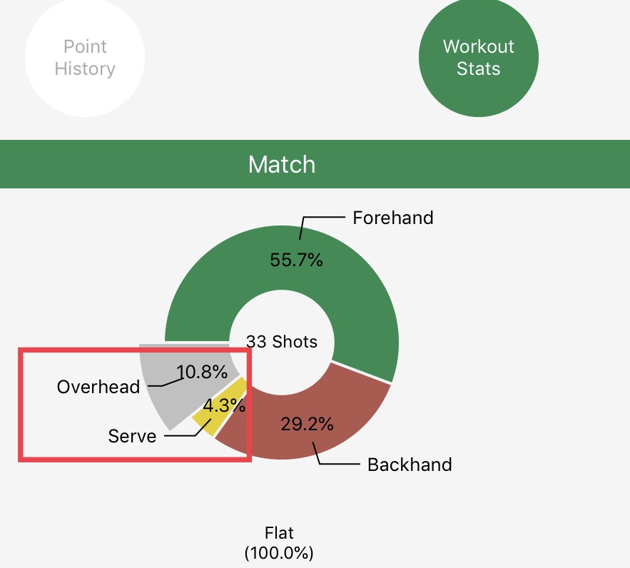
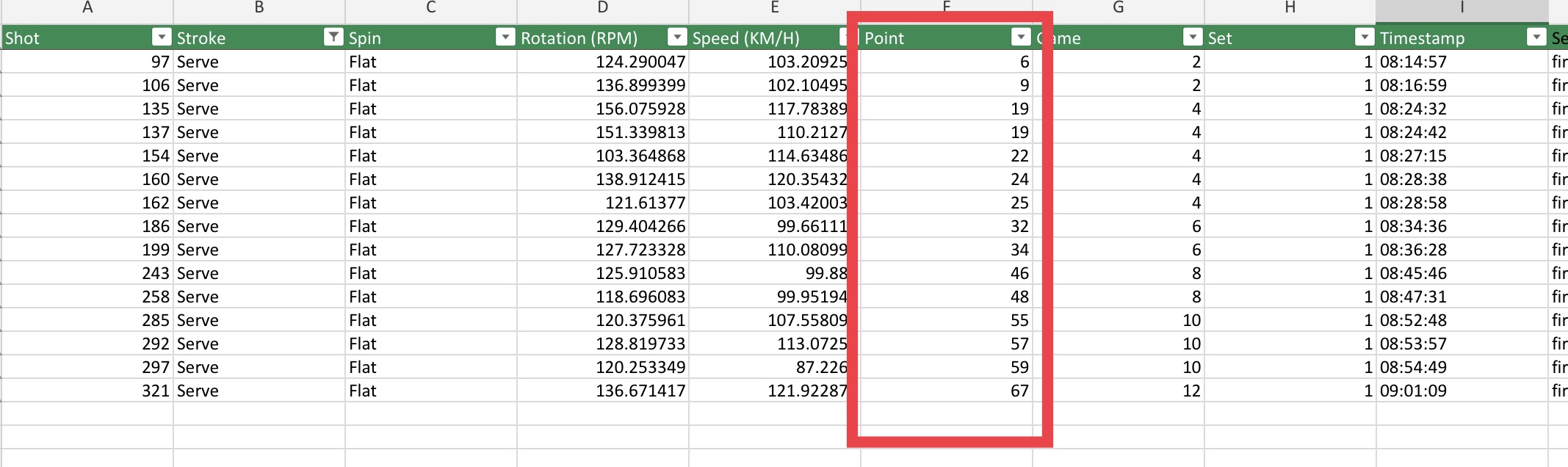
With my playing style, it is hard to believe that my overhead shots are over 2X than my serve points.
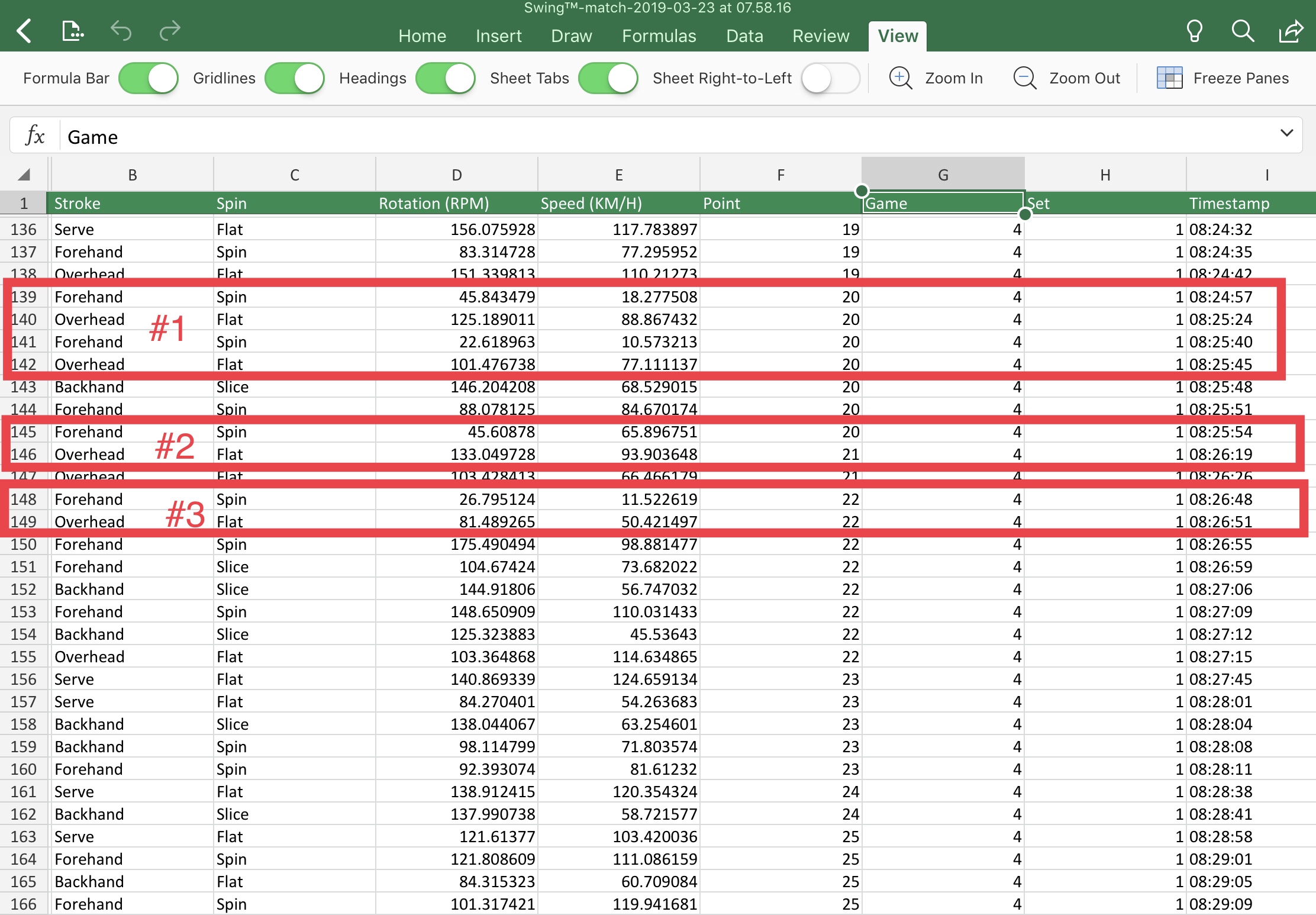
Now with the detail data export, I can pinpoint exactly the shots it was recorded (see below screenshot), and it became conclusive that these 4 serves were miscategorized as overheads shots. At the same time, all four “overheads” were accompanied by a “forehand” shot with much less speed (10-20km/h). My hypothesis here is the swing preparation motion – which involved pull my racquet to my back – was categorized with a “forehand”.
The solution:
As part of the data cleaning process, I simply just delete all those shots registered for “forehand” and “speed < 25km/h”, and then replace all the “overhead” shots when it is a start of a new point with “serve”. It appears to impact a little over half of my serves.
The downside of my fix is it only changed in my local export data file. That means it will only reflect the result if I make my own dashboard (which I do intend to do in the new couple of months) . Hopefully, the team can validate if this is a global problem, and address it in their server side.
Additional metrics: Calculating Avg 1st/2nd serve speed
Average 1st and 2nd serve speed are part of stats sheet for professionally played games. They need to be tracked separately because they are usually performed by two different purpose – 1st serve for power and 2nd serve for precision. It was NOT available in the native Swing App, which is both disappointing and surprising.
Let us try to get it by ourselves.
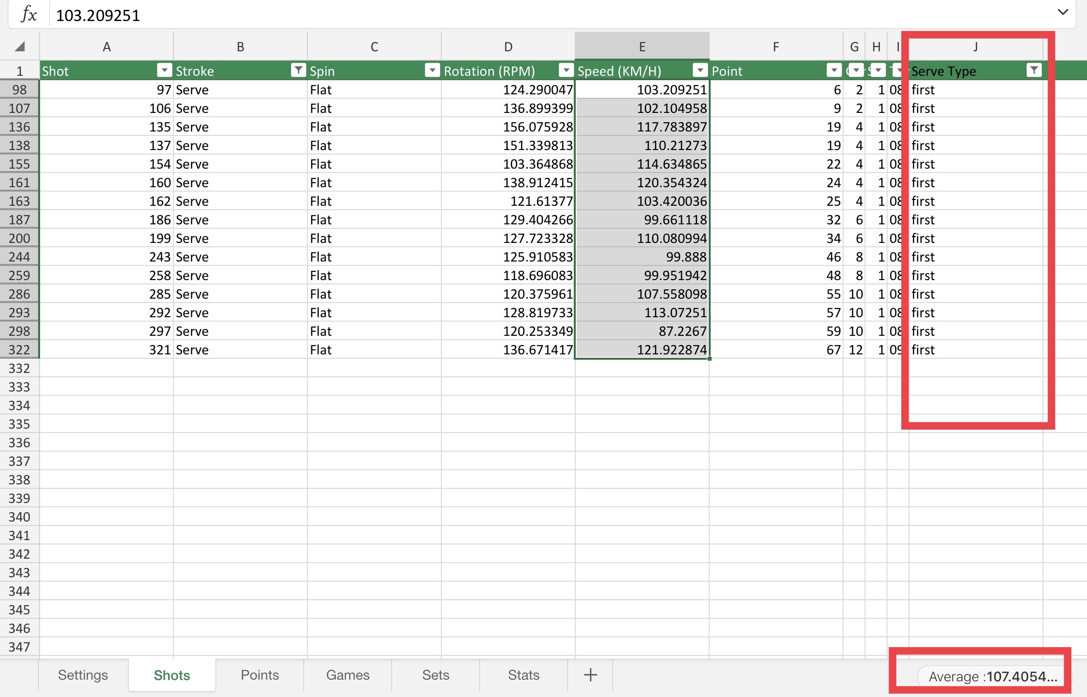
By exploring the data set, it is clear that we can separate these two by using the same column across two datasets: “shot” sheet and “point” sheet.
We can use a simple vlookup formula in excel to bring “serve state” field the “shot” sheet, and then calculate the average speed of all the first serve and second serve. (See below screenshot).
Alternatively, we can upload them into a PowerPivot/PowerBI for advanced dashboarding. Let us leave it for a future post.
As you can see, my average 1st serve speed is slightly above 107 km/h, which is faster than the highway speed limit! If you have made it this far, you should be a tennis fan and know I am trying to be funny. 107 km/h for average 1st serve speed isn’t a number that a competitive player should be proud of, as a male pro player usually serves at a rate of 180km/h-200km/h.
What’s important is – now we have a benchmark that we have confidence on. All we can do next is to measure and optimize it. My goal this summer is to make it to 125km/h. I don’t even need a partner to work on my serve. Previously it was hard to keep doing it because it was boring. But with the available measurement, I believe the outcome will be different.
Closing thoughts
I am always amazed by how technology can change people’s lives. Being able to use technology to connect two things that matter to me deeply: tennis and analytics is such an enlightening moment. As I might have stated previously, this is a journey and I am just at the beginning.
In the future, I am hoping to address:
- Make more sense of the metric Rotation(RPM). As a heavy topspin user, does these metrics correlate with the quality of my spin?
- Break down all the points to short rally (1-3 shots), medium(3-9) and long (9+). Comparing my winning % across these three segments could yield interesting insights.
- Find time to build a customized dashboard. After getting all the match data exported, it became possible to measure things that matter to you the most and remove all the noise that doesn’t need. I would like to share the dashboard, the layout and the source code with you in the future.
If you are not a tennis fan, but still curious about how to use Apple Watch to track and measure your health, you can check these ones:
2 Comments