Analyze first and second serve , and rally length breakdown using exported data from Swing Tennis App
Back by popular demand, this blog post continues diving into making use of the data we captured via Swing App from my Apple Watch.
If you are new to the tennis tracking via apple watch, please check out my introductory blog post.
If you are interested in tennis, and subscribed to the Pro version of the Swing App, you will be able to export all the data to a clean Excel format. That is really cool, but what can you do about it?
In this blog, I will share my experience of playing and analyzing the raw data for over 30 hrs over the past few months. Hopefully by reading this article, you will have slightly more incentive to make use of the data, after your hard fought game and logging via Apple Watch.
We will cover the following three topics with hands-on examples:
- Basic data cleaning and data modeling for the required analysis using Excel build-in feature
- How to breakdown the first and second serve performance with speed and distribution
- How to breakdown the short, medium and long rally on game points
Data Cleaning
In my previous post, we touched upon briefly some of the data limitations, particularly on the service being incorrectly breaking down into a “forehand” and an “overhead”. Based on the communication with the Swing team via Twitter, they are aware of the issue but I am not sure if this is a global challenge that applies to other users, or it just happens to me. So instead of waiting for the team to release a new software version, I decided to fix it myself.
The first step is to figure out which rows should be considered “dirty”. Initially, I was thinking of just remove any “shots” recorded with lower than 20km/h swing speed. It might be a decent guestimate, but we can actually only run a very simple histogram analysis (See below) for all my recorded forehands.

In this example, the histogram clearly pointed out that there are statistically “outliners” for the first and second bin (Speed < 26.9km/h). They are showing over 40 recorded forehands combined. In the real world environment, they all should be close to 0 instead. In other words, remove shots 26.9km/h is a more reasonable cut over mark.
When we apply the same exercise and look at the distribution of backhands and serve/overhead, the result is much more closer to a normal bell curve (see the screenshot below)

The limitation here is we only used the sample of 1 game. Combining and visualizing multiple games could potentially yield interesting outcomes. Comparing the game just played, versus total global dataset could be another way of analyzing how did I perform today. I will leave it for next time as it will require some heavy lifting data wrangling work.
Data Modelling
Once the ETL part is completed, we need to create a data model. The model itself can be complicated, but it can also be incredibly simple like the one I am sharing today. As mentioned previously, we have two objectives:
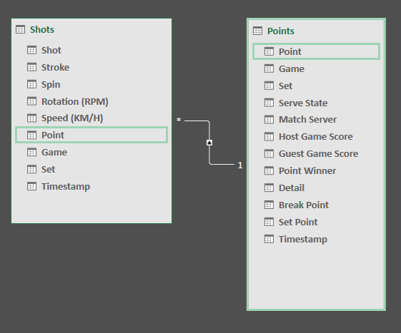
- Break down the service performance(a metric in “Shots” tab”)” to 1st and 2nd serve (a dimension in “Points” tab)
- Breakdown the rally performance (a metric in “Points tab”) by rally length (a dimension in “Shots” tab)
Both of these two are pointing out that we need to link these two tables. In the newest version of Excel, we can link that easily using the PowerPivot. (See below) in a 1-many relationship via the common field “Point”.
Once the model is built, we can create a pivot table quickly by dragging the dimensions and metrics from different tables.
Breakdown first and second serve performance
First and second service are usually performed by two different mechanics. First serve is aiming for maximum power in order to generate an advantage, and second service’s objective is to in order to get in (to avoid a double fault) and ideally generate more spin. Because of the differences, we should measure them separately but the native setup can’t show the segmentation.
Luckily, we can find “Serve State” in the “Points” table to identify if a point is actually a first or a second serve. We just need to follow the following procedure to breakdown the performance, measured by two metrics (Speed – KM/H and Rotation RPM).
- Step 1 : Make sure the shots are labeled properly. In the dataset I received, some of my service (about 5%) were still mislabeled as “overhead”. They are relatively easy to identify – When the 1st shot of the point is an “overhead”, it can be replaced with a “serve”.
- Step 2: Create a pivot table like below:
- Filter: Stroke = Serve
- Rows: Serve State, Points and Shots
- Metrics: Speed (avg), Speed(max) and Rotation(Avg), Shots(Count)
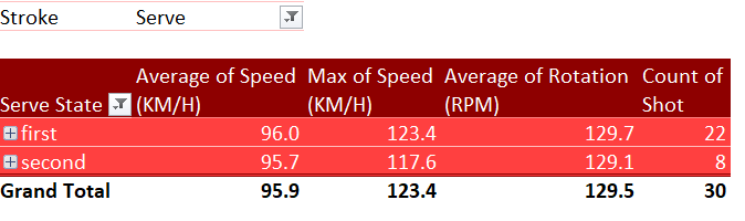
By analyzing these numbers, in this particular game my performance between 1st and 2nd serve is almost identical. This basically means that my first serve really sucks.
The other interesting point here is the count of points. Usually, the second serve should accumulate more shots. My guess is the algorithm Swing team doing has automatically delete the previous service which was out before the 2nd serve. This is not consistent when looking at the stats from multiple games I played.
Breakdown rally length
Another commonly used analysis in tennis is breakdown the rally lengths.
Rally lengths of 0-4 shots are the most common, on average, and occur about 70% of the time (on both the male and female circuits). Rally lengths between 5-8 shots occur about 20% of the time and the remaining 9 and up rally lengths occur about 10% of the time.
The ratio of the breakdowns, and its winning percentage usually represent the strategy of the game plan, and its effectiveness. For example, if the short rally has a high percentage (>=70%) and you are also winning at a decent rate (>-55%), that means you are playing an aggressive game and it is also effective.
For me, I am more defensive player and I don’t have a big serve (yet). So my game strategy is usually drag the rally longer and wait for my opportunity to approach nets, hitting winner with angles, or use topin to entice unforced errors from my opponents .
Here is the steps to complete this analysis using the data we exported from the app.
- Step 1: Create a calculated column from the “Points” table, from the data model we have created in the previous step
Rally Length=CALCULATE(COUNTROWS(RELATEDTABLE(Shots)),Shots[Stroke]<>"Serve"&&Shots[Stroke]<>"Overhead")- Step 2: Create a pivot table like below:
- Filter: None
- Rows: Rally Length – the newly created calculated column
- Metrics: Point(Count)

The final result looks like the chart above.
When we add up the points with 0-4 rallies, it is 63 % of our total points – that is quite close to the 70% benchmark. (We are counting 0, 1 and 2 rally length here because we need to double the actual rallies by two since this didn’t include my opponent’s shot).
In this particular example, it becomes clear that my advantage is actually from the longer rally, which validate my strength of stronger defense. – I am winning 61% (14 out of 23 ) of points with rally length of 4 and above. However it only consist of 21% of the total points. If I can keep the game in the longer rally, I got higher chance of winning the points.
What’s next?
In this blog I have shared two advanced metrics and analysis you can use, with the exported dataset from the Swing App. You can use these two analysis to get deeper insights into the first and second serve, as well as the rally length success rate.
Some of my early post back in 2017 are still receiving lots of traffic from Google on a daily basis. The contents is a bit outdated so I am planning to do some update.
The other thing I am thinking and planning to do is to create my own tennis automated data flow and dashboard. Once the game is completed and tracked, I just need to pull the data out and save it into my own cloud storage. And the script can run the clean, transform and data into a readable format. The tennis question is always
- How was my serve today?
- How did I execute my game plan ?
- How can I improve my game next time with the same opponent?
The app keep getting better
The Swing app made a couple of key updates this year as I am writing this post. The fact that the team is keep pushing for new boundary and trying out new features, including the recent updates on AI and video tracking (The app itself actually changed it name to SwingVision, and I am not a fan for it). Those are exciting and from business and funding perspective I also understand the importance.
I do plan to try out the video tracking once I can buy the wider lense it is recommending. Having taping the game a few times with regular iPhone Xs camera, the accuracy of the data is no were near close to the Watch version.
What’s missing to me is the ability to customize the watch button when recording points. It is quite annoying to toggle just to find the “Ace”, and I would love to move the “force error” section into the bottom section, as I don’t like to use them. Even this recently published New York Times article mentioned ” Forced errors are not a line item on the tournament statistics page. ” As I understand the importance of it, it can be calculated by using total points, subtract winners, unforced errors, Aces and serve winner.
INVS Logistics
Kız dediğin İstanbul gibi olmalı, Fethi zor, fatihi tek!